
Weekend Experiment: Get Equipped

It's Megaman! To be honest, I liked this one a lot better before I added the outlines. The drawing itself is a bit off. The background wash is streak-y. There are just a ton of things I'm not happy with here.
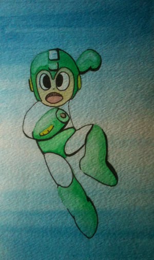
But I really liked the small washes on the feet and helmet. I am starting to become more confident fading from dark to light. It's also starting to become clear to me how to achieve more brilliant colors. As in all media, it's a matter of contrast.
There's a whole other world of color theory in watercolor. The world of simple primaries, secondaries, and tertiaries is just the surface...

Comments

Popular posts from this blog

Drawloween (at my own pace) - Pumpkins


Inktober Day 3 - "Bait"

Old school pen and ink. I haven't used a crow quill pen since high school - and, even then, I remember struggling to get it to work. This time, I thought I would try to create something using only cross-hatching. The prompt word today is "bait". This word took me into a lot of different ideas, but the one I ultimately landed on is based on the will-o-wisp. In my head, I imagined glowing orbs in front of a copse of swamp trees all created with layers of cross-hatching. Things had to be scaled back a bit. There are still two trees in the background if you look hard enough. Success? Sort of. It forced me to use a different kind of pen and, in doing so, made me want to keep going and get better with it.

Horse in Ink and Brush

Based on a toy horse I use for reference. I don't have a lot of experience with ink and brush - but I thought tonight would be a great time to just play around and try something new. Without the pressure of creating a masterpiece, I went to work immediately. I think I may have mixed too much water into my ink for this one. I really like some of the lines and relationships here. The proportions are pretty messed up, but this may be the closest I've come to getting a horse to look like a horse. I'll probably do more with ink and brush soon.